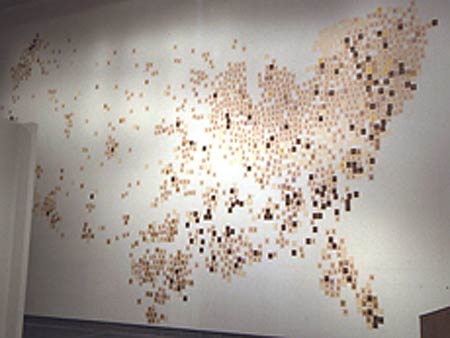
Emily Prince is an American artist, most of her work takes place in an installation format in galleries with a large portion of it being drawings. The project I'm interested in is, "American Servicemen and Women Who Have Died in Iraq and Afghanistan (But Not Including the Wounded, Nor the Iraqis nor the Afghanis)."
For this project she made small portraits of each man or woman that had lost their life and put them onto card. For the presentation these are displayed across large walls. It sounds quite simple but when I read more about it, you realise how clever it is. She forms a map from the portraits in the way she pins each portrait to the wall. They are roughly pinned in relation to where their hometown would be on a map, forming a fantastic, but tragic documentary of just what the war has cost America.
It's also a project on human nature though, the title implies this. The focus has always been on the soldiers and servicemen/women who have lost their lives, but the wounded or dead list of civilians is just as large and goes largely ignored. How often does the news mention the war these days unless someone has died? Thousands are also severely injured from it and have to live with this for the rest of their life, but they're never the focus. At the same time, the project also questions the purpose of war and is it worth all these lives. Using drawings rather than photographs seems to make it seem more real which I wouldn't have thought.
I like that the way it's an installation using the portraits and the text makes people interact and pay more attention. Possibly if I was seeing it in a gallery, it would seem so much impactful because you know a lot of people have lost their lives but until it's all laid out in one room, on top of each other and taking up so much space, you don't quite consider how many. She also adds the personal touch by including details on each portrait that she found out from "Honor the fallen" that only includes simple facts but still makes it feel harder to take and accept. Adding names and details brings them to life again and it must be a very powerful installation to view.
It's a striking layout and at first doesn't quite detail the project until you read further and realise how important and how sad it is.


I find it fascinating and touching as a project, but it's also great research for layout and how to present a project which is something I'll need to consider for my wishes project.
No comments:
Post a Comment